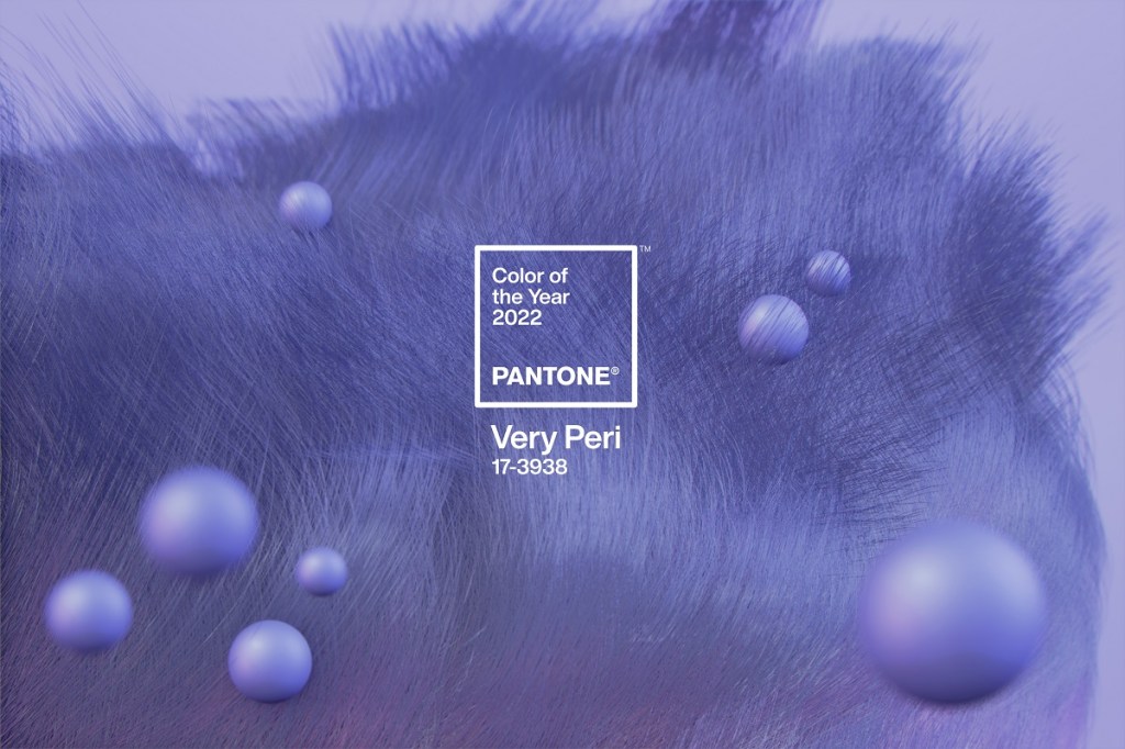
Pantone has selected a new blue shade, Very Peri, as the Pantone Color of the Year for 2022. The periwinkle blue hue with a violet-red undertone blends the faithfulness and constancy of blue with the energy and excitement of red to create “an empowering mix of newness.”
According to the Pantone Color Institute, Very Peri (PANTONE 17-3938) is a symbol of the global zeitgeist of the moment and the transition the world is going through. As people emerge from an intense period of isolation, notions and standards are changing, and physical and digital lives have merged in new ways.
Courtesy Pantone
“As we move into a world of unprecedented change, the selection of PANTONE 17-3938 Very Peri brings a novel perspective and vision of the trusted and beloved blue color family,” says Leatrice Eiseman, executive director at the Pantone Color Institute. “Encompassing the qualities of the blues, yet at the same time possessing a violet-red undertone, PANTONE 17-3938 Very Peri displays a sprightly, joyous attitude and dynamic presence that encourages courageous creativity and imaginative expression.”
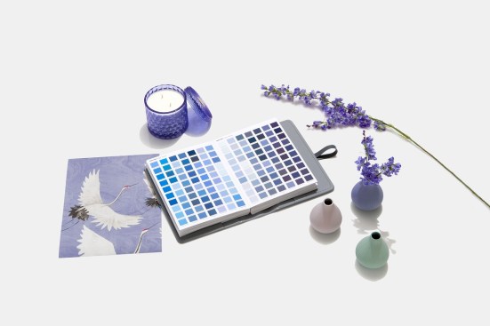
Inside the home, Very Peri injects a sense of playful freshness into interiors, enlivening spaces through unusual color combinations. The dynamic shade is suited to an array of different materials, textures, and finishes, providing a pop of color, whether introduced through a painted wall, accent furniture or home décor, or acting as an eye-catching accent in a pattern.
Courtesy Pantone
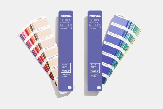
“Creating a new color for the first time in the history of our Pantone Color of the Year educational color program reflects the global innovation and transformation taking place,” adds Laurie Pressman, vice president of the Pantone Color Institute. “As society continues to recognize color as a critical form of communication and as a way to express and affect ideas and emotions and engage and connect, the complexity of this new red-violet-infused blue hue highlights the expansive possibilities that lie before us.”