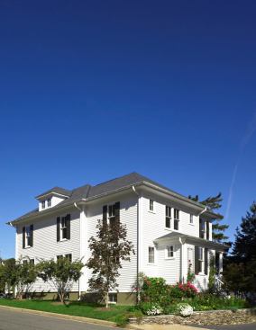
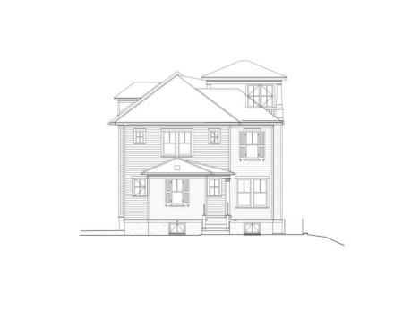
The addition to this 1910 Four Square looks spot-on from the street. Even better, it made way for a nicer kitchen, lots of daylight, and two times as much porch space while holding tight to the home’s traditional good looks.
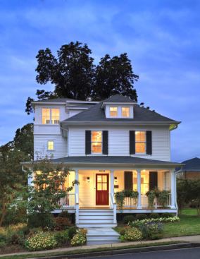
A 1910 four square got new life when a three-story tower additio…
A 1910 four square got new life when a three-story tower addition was added to its left side.
Hoachlander Davis Photography
The house was falling down, but the owners didn't want to demoli…
The house was falling down, but the owners didn't want to demolish it. What's more, the lot was too small to support a bigger house under current zoning–there was only a sliver of buildable land. Along with builder Gabriel Nasa, Moore was able to expand the house with a variance and the argument that this would allow for modest expansion and preservation.
Hoachlander Davis Photography
When the owners were cleaning out the attic, they made a great d…
When the owners were cleaning out the attic, they made a great discovery: The house had views clear to the Washington Monument. A lookout room and an office cas the new addition and take full advantage of the vistas.
Hoachlander Davis Photography
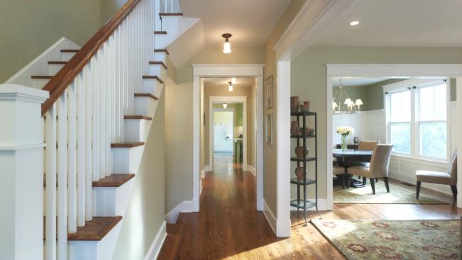
The home's traditional interiors remain, but they've been opened…
The home's traditional interiors remain, but they've been opened up. Stairs were rebuilt (knocking out the hall bathroom on the second floor made more room), and the core plan was maintained.
Hoachlander Davis Photography
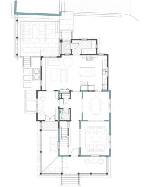
By opening up the downstairs floorplan, Moore kept the rooms def…
By opening up the downstairs floorplan, Moore kept the rooms defined as living, dining, and eating places, yet created a "figure eight" configuration that lets the rooms flow into each other and avoids dead-end spaces.
Hoachlander Davis Photography
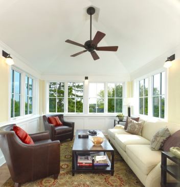
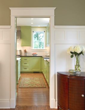
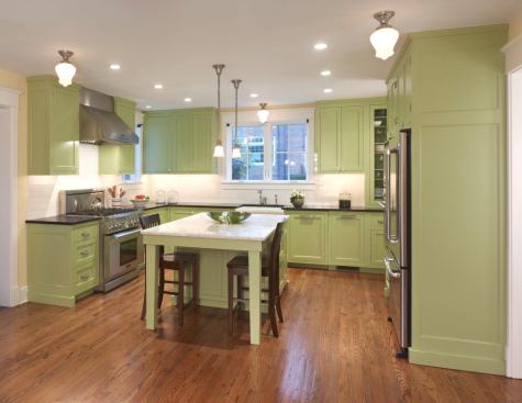
The new addition houses a hard-working U-shaped kitchen that flo…
The new addition houses a hard-working U-shaped kitchen that flows into the family room, as well as into the mudroom, a back entryway to the house that's convenient to the rear detached garage.
Hoachlander Davis Photography
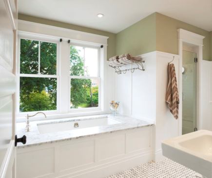
The bathtub is on a south wall, taking advantage of sunlight. Do…
The bathtub is on a south wall, taking advantage of sunlight. Double-hung windows are thermally paned and energy efficient. The bath isn't large, yet it includes a two-headed shower, tub, twin pedestal sinks, a toilet, and a free-standing vanity. Three-quarter height wainscoting and a darker paint color on the upper wall make the space strong and intimate.
Hoachlander Davis Photography.
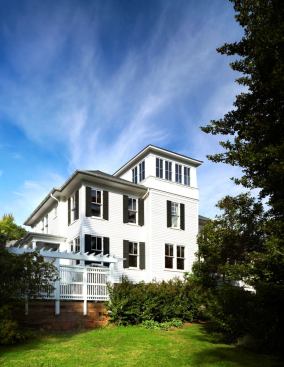
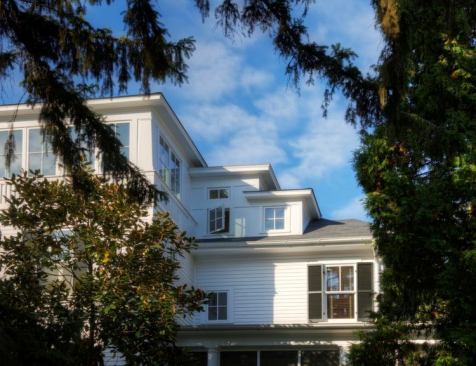
The home is a seamless melding of old and new. “We have a thir…
The home is a seamless melding of old and new. “We have a third floor tower that’s glass, and that’s not in any four square I’ve ever seen,” says Moore. The designed the tower to look as if it had always been there and got glassed in over time.
Hoachlander Davis Photography
"The owners wanted a larger, better house, but didn't want …
"The owners wanted a larger, better house, but didn't want to destory the integrity of the old one in order to achieve their goals," says Moore. Because the house was salvaged, not demolished, the builder and architect were able to obtain a zoning variance.
Moore Architects
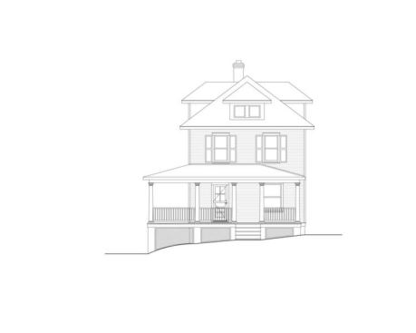
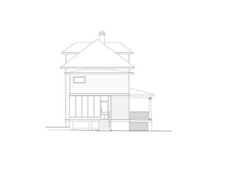
Urban Four Square was built quite close to the street. This side…
Urban Four Square was built quite close to the street. This side of the house had a porch stuck onto the front of the house that dead-ended close to the front entrance
Moore Architects
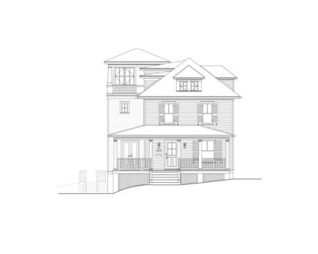
The new street elevation shows how the tower addition respects t…
The new street elevation shows how the tower addition respects the original forms of the house, buitl in 1910.
Moore Architects
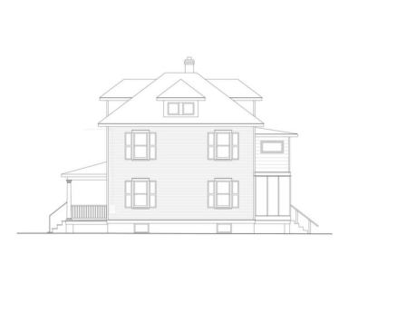
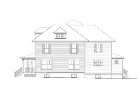
The right elevation of the house faces west, and is very close t…
The right elevation of the house faces west, and is very close to the street.
On the new right elevation, single double-hung windows were repl…
On the new right elevation, single double-hung windows were replaced with twin double hung windows to pull in as much western light as possible while maintaining privacy on the street side of the house.
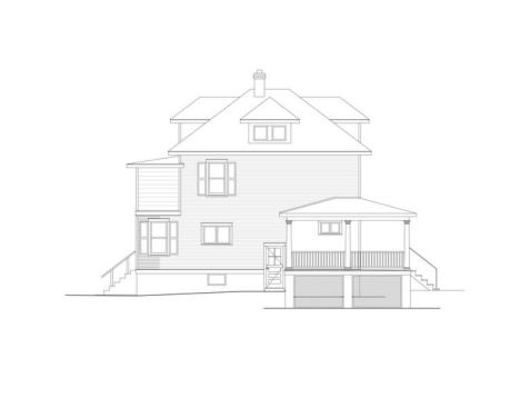
On the new left side of the house is the tower addition, plus a …
On the new left side of the house is the tower addition, plus a screen porch that wraps around the house and leads right into the tower.
On the new left side of the house is the tower addition, plus a …
On the new left side of the house is the tower addition, plus a screen porch that wraps around the house and leads right into the tower.
Moore Architects
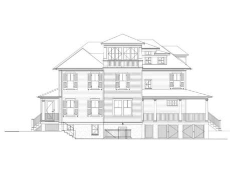
On the existing rear elevation was a screened porch stuck onto t…
On the existing rear elevation was a screened porch stuck onto the back of the house.
Moore Architects
The old back porch was torn down and a screened porch was set on…
The old back porch was torn down and a screened porch was set on the left side of the house. This made way for a mudroom entrance, which also serves as a back entry that's convenient to the detached garage.
Moore Architects
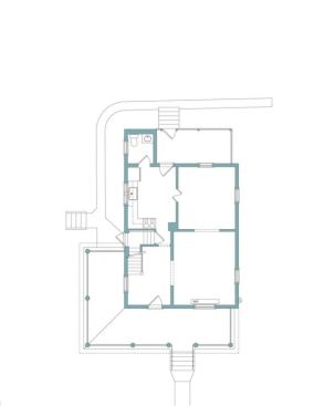
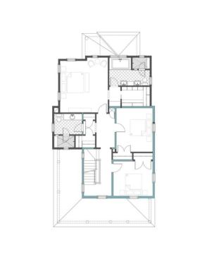
The original first floor plan is based ona typical living, dinin…
The original first floor plan is based ona typical living, dining and kitchen design. With this plan, there's definition–but also limited access and flow.The plan exists in houses all across America built in the first half of this century. But the plan doesn't reflect how we live today.
Moore Architects
The zoning variance relief allowed for a new addition to be buil…
The zoning variance relief allowed for a new addition to be built. The addition houses the study kitchen, family room, and mudroom.
Moore Architects
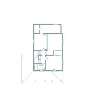
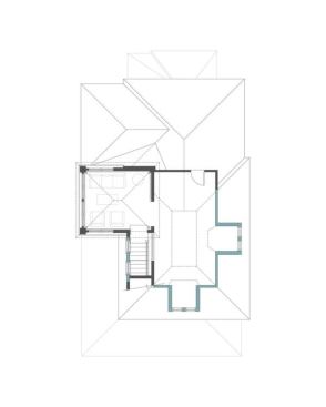
The original second floor plan didn't have enough closets, and t…
The original second floor plan didn't have enough closets, and there was a bathroom in need of a serious redo.
Moore Architects
In the new second floor plan, the master bedroom is the most imp…
In the new second floor plan, the master bedroom is the most important room. The original second floor bathroom was eliminated to make way for a more substantial stairway, and so the stairway up to the third floor could be to code. The entire stair hall used to be dark; now it's filled with light.
Moore Architects
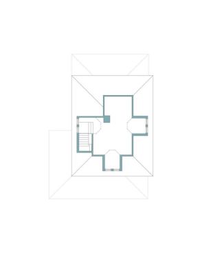
The original third floor was a dark attic. While cleaning it out…
The original third floor was a dark attic. While cleaning it out, the owners discovered views clear to the Washington Monument.
Moore Architects
The new, code-compliant stair up to the glassed-in lookout room …
The new, code-compliant stair up to the glassed-in lookout room on the third floor connects all the way down to the first floor.
“Saving old houses isn’t just for fun,” says architect Charles Moore, principal of Moore Architects in Alexandria, Va. One that he recently salvaged is a 1910 four-square in the Cherrydale section of north Arlington, Va.The house had been rental property for years, with much of the old detailing heavily worn or removed. “Most people would have bulldozed it,” says Moore. Washington real estate isn’t for the faint of heart, but the new owners, who bought the house for $600K at the height of the market, were intent on preserving the place, putting resources into a major redo that took about 10 months.
The house is close to the street, so setbacks limited substantial expansion. By salvaging the structure instead of tearing it down, Moore and builder Gabriel Nassar of GN Contracting in Falls Church, Va. got the neighbors to sign on and obtained a variance. “Without it, we would have been able to build just a sliver of additional space,” Moore says. He and Nassar built an addition that respects the original house while making it more cohesive, light-filled, and livable than it was before, and doubling the square footage (from 2,100 to 4,500 square feet). Pulling this off is harder than it looks. Here’s how they did it. (Photos by Anice Hoachlander/HD Photography)
1/ Add On, But Let the Original Shine
Highlighting the old character of the house–and not screwing it up–was the overriding challenge, says Moore of creating a high-functioning new house from an old one and unlivable one. When the new owners were cleaning out the attic of the falling-down house, they discovered views clear to the iconic Washington Monument. The first move was to set a tower addition on the left side of the house, in the rear yard. The addition hugs close to the early 1900s four square, partnering, rather than overpowering, and stepping back from the street. To make way for the new addition, a porch that wasn’t part of the original house was torn town. To ensure that the tower looked true to the original house, Moore designed the addition to appear as if had originally been capped by an open deck that, over time, had been glassed in. Height was limited, of course, to meet stringent local codes. The addition houses a kitchen, family room, study, and mudroom, which provides a back entrance to the dwelling from its detached garage. Interior finishes were replaced with details that are faithful to the period that the original house was built.
2/ Make the Porch the Connector
The original house had a screened porch that looked, as many do, “like they’re plopped onto the front of the house,” says Moore. The porch also dead-ended close to the front door. The remodel includes a front porch at the front entry that leads to a new screen-in porch that wraps around a portion of the home’s left elevation. This not only doubled the space in which the homeowners can enjoy the outdoors (minus the mosquitoes), it also provides the link between the existing front of the house and the tower addition. Now there are layers of entry space that give a gradual and easy-to-read retreat from the street: covered front porch entrance leads to screened-in side porch, which in turn leads to the study. The side porch feels more private than a front porch because it’s situated at the side of the house. The screens are subtle; Moore and Nasar placed them so they’re behind the columns and wood railing, recessed and standing in the shadow of the roof plane. “From the street,” Moore says, “it’s actually hard to see that it’s a screened-in porch.”
3/ Open Up the Plan, But Keep the Rooms Defined
The original house was made up of three basic rooms per floor, plus stairs connecting the floors. On the first level, Moore opened up the floor plan, adding what he calls a figure eight of circulation to eliminate dead-end spaces. The kitchen is a hard-working cook’s place with room for friends and family to gather, as well as designated spots for food prep and clean-up. At the same time, the new plan allows for easy flow to and from the family room and to and from the mudroom and back entryway. On the third floor, a dark attic saw new life as a light-filled lookout with great views. The stairs needed to be rebuilt so they adhered to code and allowed access to the new lookout room that caps the tower addition. To ensure that the stairs didn’t take up too much space, a series of stepped dormers come out of the main hip roof. Each tread provides the needed headspace for the stairs that lead up to the sunny new lookout room.
Project Urban Four Square, Arlington, Va. Architect Moore Architects, Alexandria, Va. Builder GN Contracting, Falls Church, Va.
Amy Albert is editor of Custom Home and a senior editor at Builder. She covers all aspects of design. Previously, she
was kitchen design editor at Bon Appetit;
before that, she was senior editor at Fine
Cooking, where she shot, edited, and wrote stories on kitchen design. Amy
studied art history with an emphasis on architecture and urban design at the
University of Pennsylvania. She lives in Los Angeles. Write her at aalbert@hanleywood.com, follow her on Twitter @CustomHomeMag and @amyatbuilder, or join her on Custom Home's Facebook page.