While the paint colors for 2024 were about creating calm, reflective spaces, the paint colors of the year for 2025 extend a conduit for creative energy, granting homeowners permission—and the confidence—to break the minimalist-style mold that held trends for years.
The major paint companies’ recently revealed choices suggest homes will radiate with color this season. There are sultry darks, lively jewel tones, calm but colorful blues and greens, and warmly nostalgic neutrals.
Here are the paint colors of the year for 2025 (so far).
BEHR: Rumors
BEHR’s Rumors is a rich, ruby red with earthy undertones and fully takes advantage of homeowners’ desire to make personal, meaningful choices with interior decor, with the tagline of “now is the time to make a statement.”
“We’re seeing people embrace color like never before,” says Erika Woelfel, vice president of color and creative services at BEHR. “Rumors is a modern take on the timeless red that creates an energetic appeal to make a lasting statement in a stunning way.”
BEHR also leverages the love for red, evidenced in one of this year’s hottest trends: the unexpected red theory.
Courtesy Lowe's / STAINMASTER Paint
Stainmaster: Truffle
Stainmaster’s Truffle is a rich, earthy brown, positioned as a dramatic and sensual color to lure homeowners to the dark side. While bold and dramatic, this color is relatively timeless and plays well with neutrals as an accent.
“We are excited to highlight Truffle, a versatile color that taps into the warm beauty of nature, offering a timeless and durable foundation for our customers’ design needs,” says Monica Reese, Lowe’s director of trend and style.
It’s a good choice for color drenching, with its warm undertones, and applying the hue to all surfaces will offer cozy comfort, similar to being in a cave.
Courtesy Minwax
Minwax: Violet
One of several offerings in the purple family this year, Minwax’s Violet is a playful purple that doesn’t take itself too seriously. Minwax describes the color as whimsical and modern, and it is positioned as a choice for homeowners to express their personality.
This wood stain leans into nostalgia and is meant to entice homeowners with the opportunity to experiment in smaller spaces, have fun, and see where the color takes them.
“Deeper, more saturated colors, including violet-influenced blues, can serve as compelling alternatives to timeless shades,” says Lisbeth Parada, Minwax color and design lead. “Violet, when paired with natural wood tones, creates a striking contrast that feels both classic and contemporary.”
Courtesy Valspar
Valspar: Encore
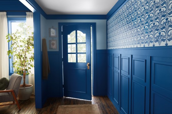
Valspar’s Encore, a cool blue, builds off the overarching theme from the success of several of the paint colors of the year from last year: shades of blue deliver calm and a timeless appeal.
“A grounding and timeless atmospheric blue hue, Valspar’s 2025 Color of the Year Encore emboldens consumers to elevate their interior and exterior spaces with their mood and happiness in mind,” says Sue Kim, director of color marketing at Valspar. “People are craving a happier home and Encore is an atmospheric hue that feels both modern yet familiar.”
Also, with the abundance of blue last year, homeowners began to recognize the value of blue as a potential neutral in a space.
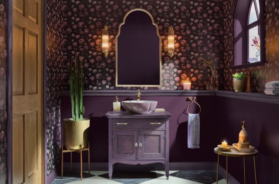
Courtesy Glidden Paint by PPG
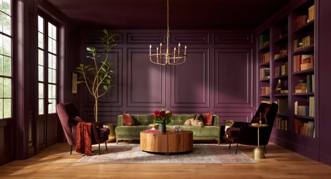
Glidden Paint by PPG: Purple Basil
Glidden Paint by PPG’s color of the year for 2024 was Limitless, a fresh, warm yellow. This year, however, their choice of Purple Basil, does a color about-face, with a high-impact, jewel-toned purple.
“So many people start their color selection journey looking at bold hues, but ultimately settle for a more expected or muted color,” says Ashley McCollum, PPG color expert, Glidden brand. “This year we are encouraging these ‘color chip daydreamers,’ as we call them, to put aside trepidation about what the neighbors will think or potential resale value. For 2025, purple isn’t just permitted, it is encouraged.”
Purple Basil is meant to be that catalyst for homeowners to take that bold first step towards self-expression with color and to be confident in their personal choices for how their homes are decorated.
Courtesy C2 Paint
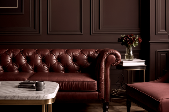
C2 Paint: Raku
Deep, dark and mysterious, C2’s Raku is a red with definite, heavy, brown undertones. It’s inspired by an ancient Japanese tea ceremony, and the color derives its authenticity from a centuries-old pottery technique that celebrates the unique, natural variations that come with handcrafted creations.
“Raku is an expression of balance, comfort, and timeless elegance,” says Philippa Radon, C2 paint color director. “In a world where polarizing views can divide and isolate, Raku offers a palette that returns us to simple, grounding pleasures.”
This color is sophisticated and seems well-suited to rooms for formal activities, such as a dining room or a home office, with rich woods.
Courtesy Dunn-Edwards Corp.
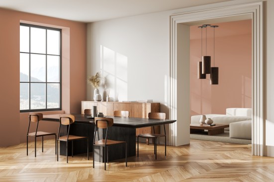
Dunn-Edwards: Caramelized
Dunn-Edwards describes their choice for their color of the year, terracotta, with warm brown undertones, Caramelized as “spicy” and “timeless.” In contrast to several of the other colors this year that are geared to pounce with a statement straight away, Caramelized is a more patient neutral, mimicking the warmth of sun-baked clay.
“In the current fast-paced, high-tech age, we find ourselves drawn to more saturated and timeless colors to create personal spaces that feel welcoming, stylish, and grounded,” says Lauren Hoferkamp, lead color expert at Dunn-Edwards.
This color is meant to act as a home base of sorts for homeowners to support other elements in the home that are meaningful and nostalgic, such as bolder colors, or vintage or sentimental decor.
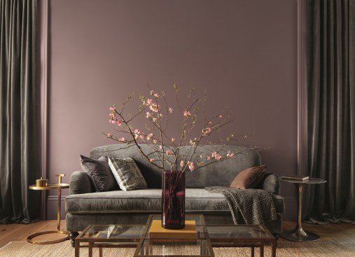
Courtesy Benjamin Moore
Benjamin Moore: Cinnamon Slate
Benjamin Moore selected Cinnamon Slate as its 2025 color of the year, a delicate mix of heathered plum and velvety brown.
“As the use of more saturated color in design has increased in recent years, we are seeing a growing interest in more nuanced colors, whose undertones add intricacy and dimension,” says Andrea Magno, director, color marketing and design at Benjamin Moore. “Cinnamon Slate is an inviting hue that offers enduring style and modern sensibility. Its depth and richness bring an air of approachability and sense of comfort throughout the home, making it a new favorite for years to come.”