Rooted. Inspired. Nurturing. Joyful. We asked Sue Wadden, director of color marketing at Sherwin-Williams, about the latest designer color trends and how to best use them.
Q: Color trends this year seem to be very grounded with pops of rich hues. What inspired your choices?
A: When we created palettes this year, it was the earth itself that anchored the choices. Even though we are always surrounded by digital life, we exist in a physical world. The colors we ended up with are deeply rooted in this reality.
Q: Your first palette celebrates nature and is made up of tranquil, peaceful colors that would traditionally work well in a bedroom or bath. Are there other places to use them?
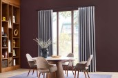
A: They definitely look good in a bedroom or bath, but they all look great on exteriors, too! They also work well in kitchens. Since green kitchen cabinets are trending, colors like Hamburg Gray (SW 7622) or Evergreen Fog (SW 9130 295-C6) are great choices. Urbane Bronze (SW 7048 245-C7) and some of the beige colors look great there, too. White and gray kitchens are timeless, but weaving in these nature-inspired colors on cabinets or a feature wall brings harmonious results.
Q: How did your artisan-inspired palette come to be?
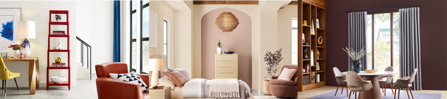
A: With this palette, we were inspired by how the pandemic lockdown re-sparked an interest in making things with our hands. So, we created a balanced palette that evokes global craftivism and DIY. Carnelian (SW 7580 275-C6) is one of my favorites. I’ve put it on both kitchen cabinets and in offices—it looks amazing. It’s a wine color, but it’s not bright, so it’s very sophisticated. It would be beautiful on exterior doors and shutters, too. You have to really embrace the love of color to use a rich color like these, but once they are up, it’s fabulous!
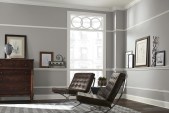
Q: There is another palette inspired by “care culture,” which contains grounding, comforting colors. How should these be used?
A: These colors are almost cosmetic in nature, but they’re also informed by energy centers in the desert. Just looking at this collection gives you a calm, easy feeling, right? What I love about this beige/brown monochromatic palette is that several of the colors can be used in any room. By layering them, you achieve a very soft, soothing result.
Q: Your final palette has a totally different vibe. How does it relate to the rest?
A: Since we spend so much time inside now, the colors we use in our living spaces are more important than ever. This palette is all about the happy factor, which easily ties back to caring for ourselves and each other.
Q: It contains bright, lively hues as well as nostalgic, familiar, mid-century tones. Should they all be used in the same space?
A: This palette isn’t meant for all the colors to be used at once. It’s about thoughtfully choosing a few colors that bring joy to a space. For instance, I’d use an anchoring color like Skyline Steel (SW 1015 283-C3) in a home office, but would create a “peekaboo” space where the view through a door or window is energized by a pop of energetic color. I love Peppery (SW 6615 717-C6) on a kitchen island for just this purpose.
Learn more about Sherwin Williams’ 2023 Colormix Forecast at swcolorforecast.com.