We spoke with Sue Wadden, director of color marketing at Sherwin-Williams, about the recent biophilic design trend and how it can promote health and wellbeing in interior spaces.
Q: There’s a buzz about biophilic interior design. What is it?
A: The term “biophila” was coined by social psychologist Erich Fromm, who described it as “the passionate love of life and of all that is alive.” It’s about a basic need for humans to be around nature to feel good. Biophilic design is about using natural elements to create nurturing, healthy spaces. Biophilia is often used in healthcare design, but it can be applied to any interior.
Q: How can natural elements make people feel better?
A: There have been numerous studies proving we are happier and healthier when we’re connected to nature. For instance, one study showed that if hospital patients look out a window rather than at a brick wall, they got better faster, and their length of stay was shorter.
Q: What’s the difference between “green” and “biophilic” design?
A: Green design is about bringing healthy products into the home. Energy-efficient appliances, non-toxic building materials, low-VOC paint. Biophilia is about using natural design elements to create healthy, calm and caring spaces.
Q: How can a builder talk about biophilic design?
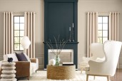
A: It might be easier to just call it “outside-in living”! You can suggest bigger windows to bring nature into better view. Use natural materials as opposed to synthetic—wood floors rather than vinyl, actual stone rather than concrete. Green plants can breathe life into interiors. And color goes a long way to adding wellbeing to a space, too.
Q: How does color play into biophilic design?
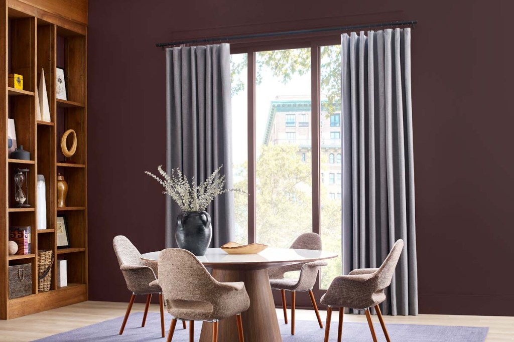
A: Color is foundational for biophilia. For instance, we had such a reaction to being inside all the time during the pandemic that people want to get away from the cold grays that have been popular since 2008. We want color to ground and inspire us, and blues, greens and warm browns do that. So natural colors are at the heart of what inspired us to create our 2023 Colormix Forecast. The palette draws on the forest, desert horizons, and natural materials like gemstones and vegetable dyes. The colors draw a physiological response because they are of the earth and so are we.
Q: Where should these colors be used?
A: Consider adding to unexpected places, like cabinets, vanities, or ceilings. Try a blue like Indigo (SW 6531 178-C7) or a green like Mount Etna (SW 7625 279-C2) to create an immersive, powerful experience.
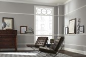
Q: What if my client is hooked on gray?
A: Color trends are warming up, but some clients are attached to gray. You can help them modernize their home by suggesting a warmer neutral, like Kestral White (SW 7516 266-C5). It’s all about finding a balance, and that’s what nature teaches us, right? Balance.
Learn more about Sherwin Williams’ 2023 Colormix Forecast at swcolorforecast.com.